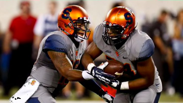
Some controversial old Syracuse football uniforms have surprisingly received national recognition. Here are the details and why this is actually disturbing.
Syracuse football just got some awesome new uniforms from the folks over at Nike, thanks to a multi-year agreement with the University.
It seems to be a great combination of respecting tradition and embracing a bright future. Not only did Syracuse fans think it was amazing, even the leading uniform experts over at Uni-Watch gave it rave reviews.
While even if you didn’t love the new uniforms, Syracuse fans at least universally agree it was better than what they had previously with hard to read numbers and just an overall aesthetically unappealing product.
With all the uniform talk, Gabe Henderson of FanSided chose to rank the top-30 college football jerseys in the nation and Syracuse football made the top-10 of this list, but not for the jerseys you may be thinking of:
"“The three Syracuse jerseys and the seemingly endless uniform combinations are all very good-looking. However, it’s the grey alternates that take the cake when it comes to the best.The grey Syracuse uniforms have a unique style to them. The grey jersey features a majority navy, with all lettering and numbering being done in the dark blue shade. Further, the navy blue lines on the shoulder and arm give the jersey a fading look on the side, a pattern unseen throughout the rest of the list. As opposed to using the typical Syracuse orange color, it seems as if Nike went with a neon-tinted orange for these alternate uniforms. The neon orange pops and stands out above the rest of the colors, which are fairly dark.At first glance, these uniforms do not look like they’d belong to Syracuse. However, I’m sure the Orange are glad to have them as they are some of the coolest uniforms in the country.”"
Just to give you a visual, here’s what the old Syracuse “grey” uniforms looked like:
— InsideTheLoudHouse (@LoudHouseFS) June 24, 2019
While in most situations being ranked in the top-10 would be an overwhelmingly positive thing, in this case, it isn’t.
Those gray Syracuse uniforms were quite frankly an abomination. This team is called the Syracuse Orange, not the Syracuse Grey. (We currently have a poll up on social media, included above, make your voice heard do you like the old Syracuse uniforms?)
The new Nike uniforms do Syracuse University justice by embracing the brand: ORANGE in bold letters across the front of every combination of the jersey that was presented late last week.
It just doesn’t and didn’t make sense. Sometimes apparel companies can try to do too much and this was the case here. When the grey jerseys were on the field, I wasn’t sure what game was I watching, the Georgetown Hoyas?
According to Nike officials, there may be a future alternate jersey revealed at a later date for special occasions for Syracuse, but nothing to report yet.
We can only hope that a “future” gray Syracuse alternate isn’t coming to the hill. Despite the very nice things that were said about them in that FanSided article.
